


A landing page can look completely normal — and still get your ads rejected.
That’s usually the point where people start blaming the platform.
The copy looks safe. The design looks clean. Nothing obviously misleading, nothing aggressive enough to feel risky.
And still — review instability starts showing up.
I’ve had landing pages where the issue wasn’t visible until I stepped through the funnel like a user.
That’s when the pattern became obvious.
Not in any single element.
In how the experience unfolded.
Because platforms rarely reject landing pages for one isolated reason.
They reject them because the overall pattern starts resembling something unreliable.
Landing Pages Are Evaluated as Part of the Funnel
This is the first thing most advertisers underestimate.
The landing page is not reviewed independently.
It’s reviewed as a continuation of the ad.
That means the system is constantly comparing expectations:
what the ad suggests
what the page actually delivers
how smoothly the transition happens
I’ve seen perfectly “safe” landing pages get flagged simply because the tone shifted too much from the ad.
Not because the page violated policy.
Because the experience stopped feeling consistent.
The system compares the gap, not the elements.
Small Shifts in Tone Can Trigger Review Issues
Most mismatches are subtle.
The ad introduces softly.
The landing page pushes harder.
That shift alone can create risk.
This is how it often looks in practice:
Ad: “Learn how businesses improve conversion rates” (observational, informational)
Landing page: “Start increasing your conversions immediately” (direct, outcome-driven)
Result: informational framing → immediate outcome expectation
Nothing technically false.
But the expectation changes.
I’ve had campaigns where softening the landing page headline stabilized approvals without changing the offer itself.
Delayed Clarity Is One of the Biggest Risk Signals
This is probably one of the most common structural problems I see.
The ad clearly explains the offer.
The landing page delays the explanation behind interaction.
Forms. Qualification steps. Multi-step flows.
From a conversion perspective, this is normal.
From a review perspective, it can look like the user is being pushed toward action before understanding what they’re getting.

On its own, this structure is not automatically a violation.
But it becomes risky when the ad already establishes a clear expectation and the landing page suddenly withholds that same clarity.
I’ve tested this directly: moving the explanation higher reduced rejection frequency without changing any wording.
Same funnel.
Different interpretation.
Visual Signals Can Change the Entire Meaning
One thing advertisers consistently underestimate is how heavily platforms rely on visual interpretation.
I’ve had landing pages with neutral copy still get flagged because the visuals implied much stronger outcomes than the ad itself suggested.
Charts. Transformations. Aggressive growth imagery.
No explicit promises.
But a completely different narrative.
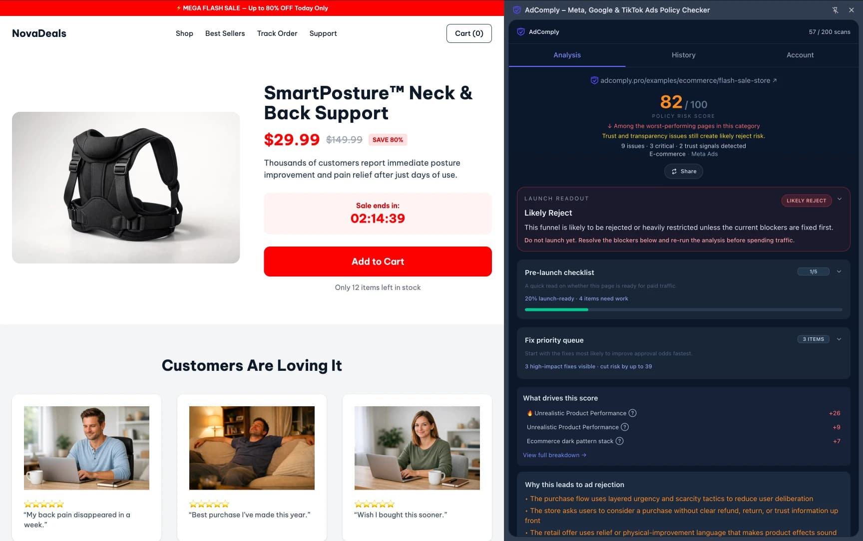
That’s where things become dangerous.
The system isn’t just reading text.
It’s reconstructing expectations from the entire page.
And if the landing page visually escalates the promise beyond the ad, inconsistency starts building.
Every Additional Funnel Step Creates More Risk
This becomes even more fragile in funnels that use bridge pages or pre-landers.
Every extra step creates another comparison point for the system.
I’ve seen funnels where the ad and final landing page were aligned — but the bridge page introduced a slightly more aggressive tone.
That alone destabilized approvals.
Not because the bridge violated policy.
Because continuity broke in the middle.
The more transitions you create, the easier it becomes for interpretation drift to happen.
Landing Pages Get Rejected for Accumulated Signals
This is another important shift.
Most landing pages don’t fail because of one massive violation.
They fail because multiple smaller signals start stacking together.
slightly stronger wording
slightly delayed clarity
slightly more aggressive visuals
slightly higher urgency
Each signal alone might not matter.
Together, they create a recognizable pattern.
I’ve seen funnels where removing just one aggressive section improved approval stability dramatically.
Not because that section was “bad”.
Because it pushed the overall pattern over the threshold.
Trust Signals Quietly Affect Review Outcomes
This part rarely gets discussed, but it matters more than people think.
Landing pages without basic trust elements tend to become more fragile during review.
Missing contact information. Weak branding consistency. Incomplete policy pages.
Find Rejection Risks Before You Submit
Scan your ad funnel for policy risks, risky claims, landing-page issues, and ad-to-page mismatches before review.
No signup required • instant results • 5 free scans included
None of these automatically trigger rejection.
But they lower the overall trust baseline.
I’ve seen rejection rates improve after adding simple structural trust elements without touching the core funnel.
The page simply started looking more stable overall.
Sometimes the Problem Is the Transition, Not the Page
This is where many teams waste time.
They keep editing the landing page itself.
Meanwhile, the actual issue exists in the transition from ad → page.
I’ve had cases where the landing page looked perfectly fine until I compared the emotional tone of the ad creative against the first screen of the page.
That’s when the mismatch became obvious.
Not in the content.
In the momentum.
I’ve even had situations where changing the CTA button color on the page to match the dominant color from the ad creative noticeably reduced manual reviews.
Nothing else changed.
The experience simply stopped feeling fragmented.
This is closely related to how ad review systems compare ads and landing pages, where continuity and interpretation become key review signals.
Why Landing Page Rejections Often Feel Random
The frustrating part is that these patterns are rarely obvious.
Before you launch: A quick scan can show the issues that often lead to ad rejection before you send the campaign for review.
Scan your funnel now →You can review the page ten times and still miss the issue.
Because the system is not evaluating isolated elements.
It’s evaluating alignment across the entire experience.
I’ve seen funnels run clean for days, then suddenly start getting flagged once enough signals accumulated.
Not because something changed.
Because the pattern became easier to classify.
The Shift That Makes Landing Page Rejections Predictable
At some point, the question changes.
Not “what rule is this page breaking?”
But “what pattern is this page creating?”
That shift changes everything.
You stop obsessing over isolated words.
You start analyzing continuity, timing, and expectation flow.
If you want to see how these rejection patterns appear in real funnels, explore ad risk examples with detailed breakdowns.
Because landing pages usually don’t get ads rejected because of one obvious mistake.
They get rejected because the overall experience stops feeling predictable.
And once that happens, the outcome becomes much easier for the system to classify.