


Fixing consistency issues sounds straightforward.
Make the ad match the landing page. Align the messaging. Keep things “on brand”.
That’s the advice you’ll usually hear.
In practice, it doesn’t work like that.
I’ve had funnels where everything looked aligned on paper. Same offer, same wording, same intent.
And still — rejections kept happening.
Or the ads would pass, but performance felt unstable. Conversions dropped. Costs went up.
That’s usually the point where you realize the problem isn’t “message mismatch” in the obvious sense.
It’s structural inconsistency.
And that’s much harder to fix if you don’t know where to look.
Why Most Consistency Fixes Don’t Work
The default approach is to tweak wording.
Rewrite the headline. Adjust the claim. Add a disclaimer.
Sometimes that helps.
But often it doesn’t.
I’ve seen cases where changing copy had zero impact — until the structure changed.
Because the system isn’t just reading what you say.
It’s interpreting how the experience unfolds.
And if the flow feels inconsistent, no amount of wording fixes that.
Start With the Transition, Not the Content
The biggest mistake is reviewing the ad and landing page separately.
You check the ad. It’s fine.
You check the page. Also fine.
But the issue lives in the transition.
I’ve gotten into the habit of always going through the funnel like a user.
Read the ad. Click it. Land on the page.
And pay attention to the first few seconds.
That’s where the mismatch usually appears.
Not as a contradiction — as a shift.
Fix the First Screen Before Anything Else
If you only fix one thing, fix the above-the-fold section.
That’s where the expectation from the ad gets either confirmed or broken.
I’ve had funnels where the entire page was fine — except for the first screen.
Too aggressive. Too vague. Too different from the ad.
Changing just that part stabilized approvals.
No full rewrite. No redesign.
Just alignment at the entry point.
Align Framing, Not Just Words
Consistency isn’t about repeating the same sentence.
It’s about maintaining the same framing.
This is where things often go wrong:
ad is exploratory → page becomes decisive
ad is conditional → page feels guaranteed
ad introduces → page pushes
Even if the wording overlaps, the framing shifts.
And that’s enough to trigger a mismatch.
This is usually how it shows up in practice:
Ad: “Find out if this approach fits your situation” (open, conditional)
Landing page: “This system works for anyone ready to start” (broad, outcome-leaning)
Result: narrowed condition → expanded promise → inconsistency
I’ve seen this exact pattern in multiple niches. Nothing technically false, but the shift changes how intent is interpreted.
Bring Clarity Forward
Another common issue is delayed explanation.
The ad is clear about what’s being offered.
The landing page holds that clarity back.
I’ve tested this more than once — moving key information higher on the page reduced rejection frequency without changing the message.
Find Rejection Risks Before You Submit
Scan your ad funnel for policy risks, risky claims, landing-page issues, and ad-to-page mismatches before review.
No signup required • instant results • 5 free scans included
That’s because timing affects interpretation.
If the system sees action before clarity, it assumes higher risk.

This is where many funnels break without realizing it. The offer exists — just not where the system expects it.
Remove Signals That Escalate the Message
Sometimes the mismatch isn’t about missing alignment.
It’s about added intensity.
I’ve had landing pages that technically matched the ad — but layered in extra urgency, stronger visuals, or repeated outcomes.
Each addition was small.
Together, they pushed the page beyond the tone of the ad.
That’s when the system starts seeing two different versions of the same offer.
And that’s where rejections begin.
Fix Visual Consistency Too
This part is easy to overlook.
You align the copy, but leave the visuals untouched.
I’ve seen pages where the text was neutral, but the visuals implied strong results.
Charts. Transformations. Performance indicators.
Before you launch: A quick scan can show the issues that often lead to ad rejection before you send the campaign for review.
Scan your funnel now →Even without explicit claims, those visuals changed the narrative.
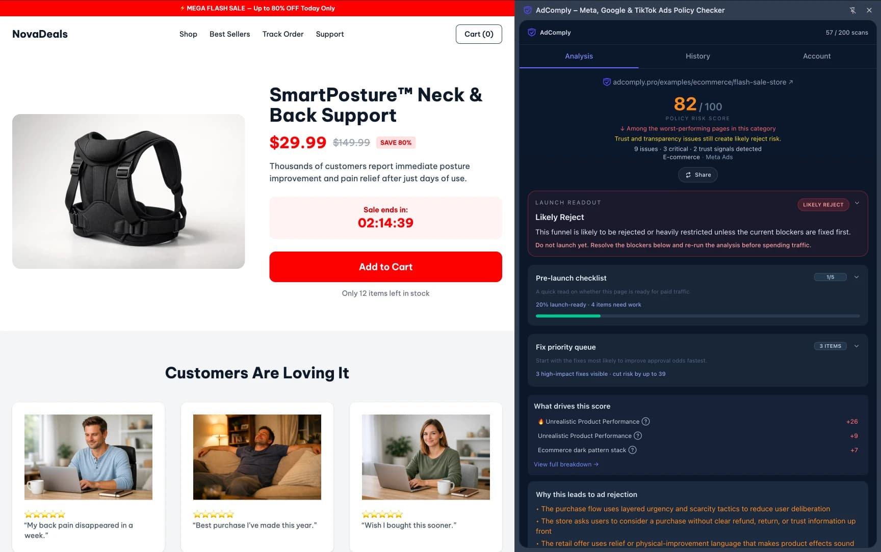
In one case, removing a single image improved approval consistency without touching the copy.
That’s how much weight visuals carry.
This kind of escalation often overlaps with misleading claim patterns, even when no direct claim is written.
Consistency Fixes Often Mean Removing, Not Adding
This is counterintuitive.
Most people try to fix consistency by adding explanations, disclaimers, or extra context.
Sometimes the better move is to remove.
I’ve had funnels where deleting a single section — not rewriting it — fixed the issue.
Because that section introduced a new layer of interpretation.
Once it was gone, the flow became coherent again.
Think in Terms of Flow, Not Pages
This is the shift that makes consistency easier to manage.
Stop thinking about “ad” and “landing page” as separate assets.
Think of them as one continuous experience.
I’ve found it useful to ask a simple question:
Does the landing page feel like a natural continuation of the ad?
If the answer is even slightly “not really”, that’s where to look.
Fixing Consistency Is About Removing Interpretation Gaps
At its core, consistency is about reducing ambiguity.
The system doesn’t need perfection.
It needs clarity.
When the message stays stable from start to finish, the system doesn’t have to interpret anything.
And when it doesn’t have to interpret, risk goes down.
If you want to see how these fixes look in real scenarios, explore ad risk examples with breakdowns of how alignment improves approval.
Consistency issues don’t come from obvious mistakes.
They come from small shifts.
And fixing them is less about writing better copy — and more about keeping the same signal all the way through.